Sam’s Burgers Branding
When you think of the United States of America, the first 3 things that come to mind would be; classic cartoons that appeared in the early 1900s and have been a guest in every home, the hamburger, which is the culinary symbol of the United States of America, and of course Uncle Sam. These 3 concepts come together in Sam's Burgers. The idea of Sam's Burgers is the result of designer Sarp Mostar blending his admiration for classic cartoon characters with the name Sam, the American Dream and the concept of hamburgers.
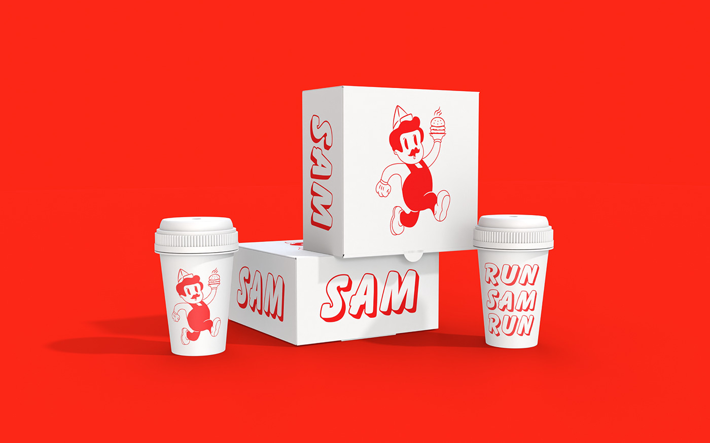
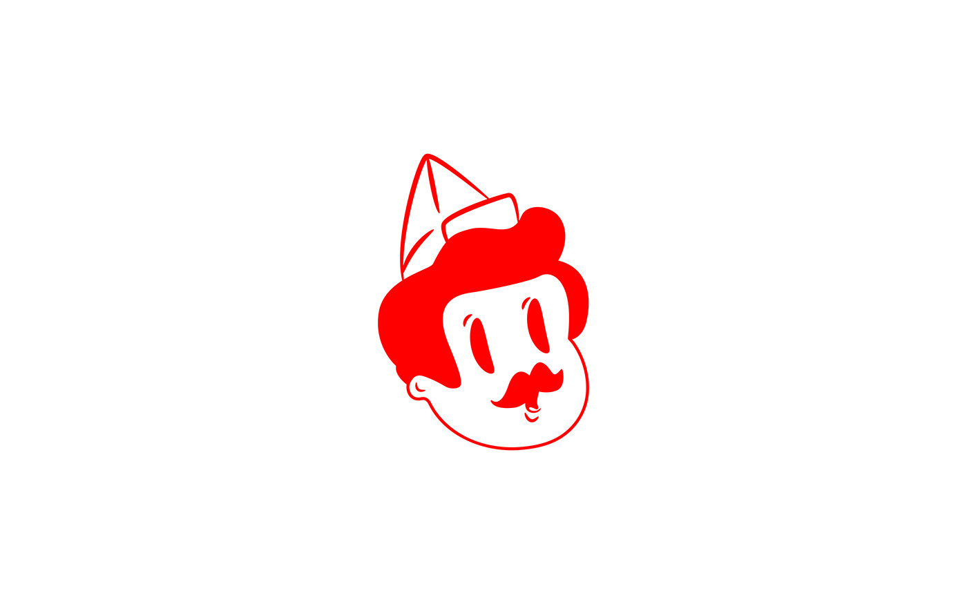
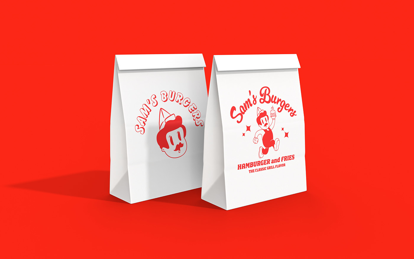
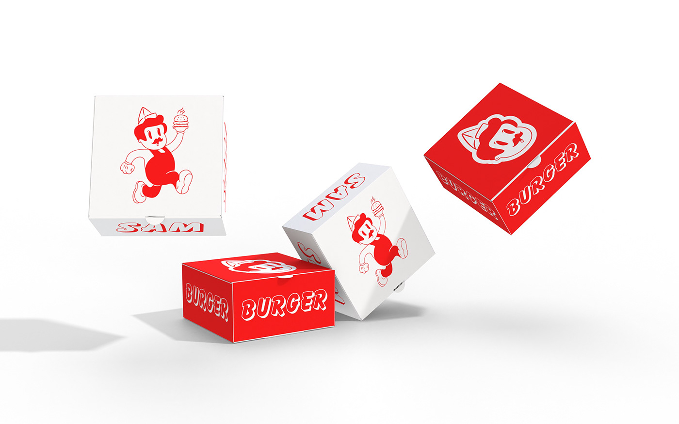
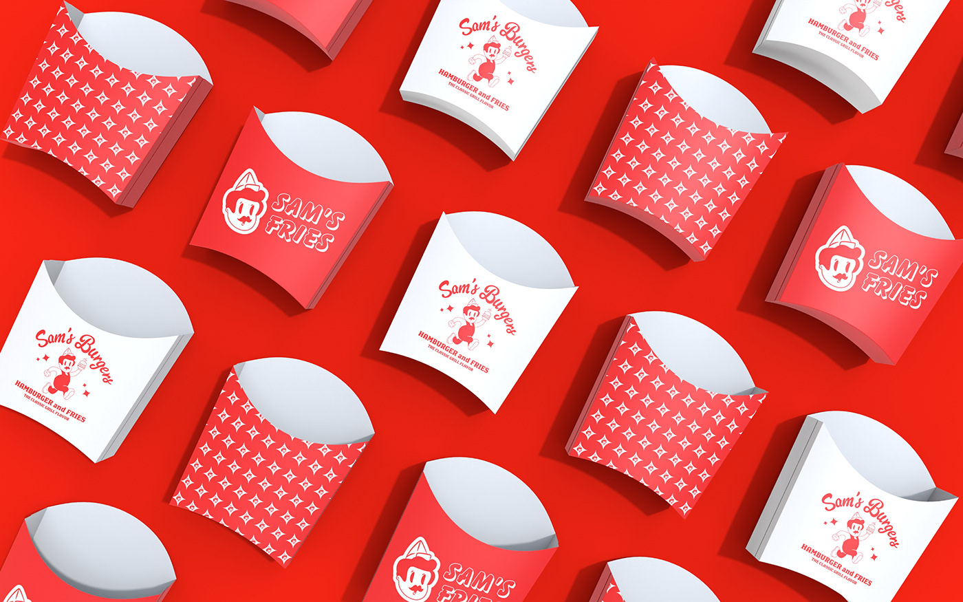
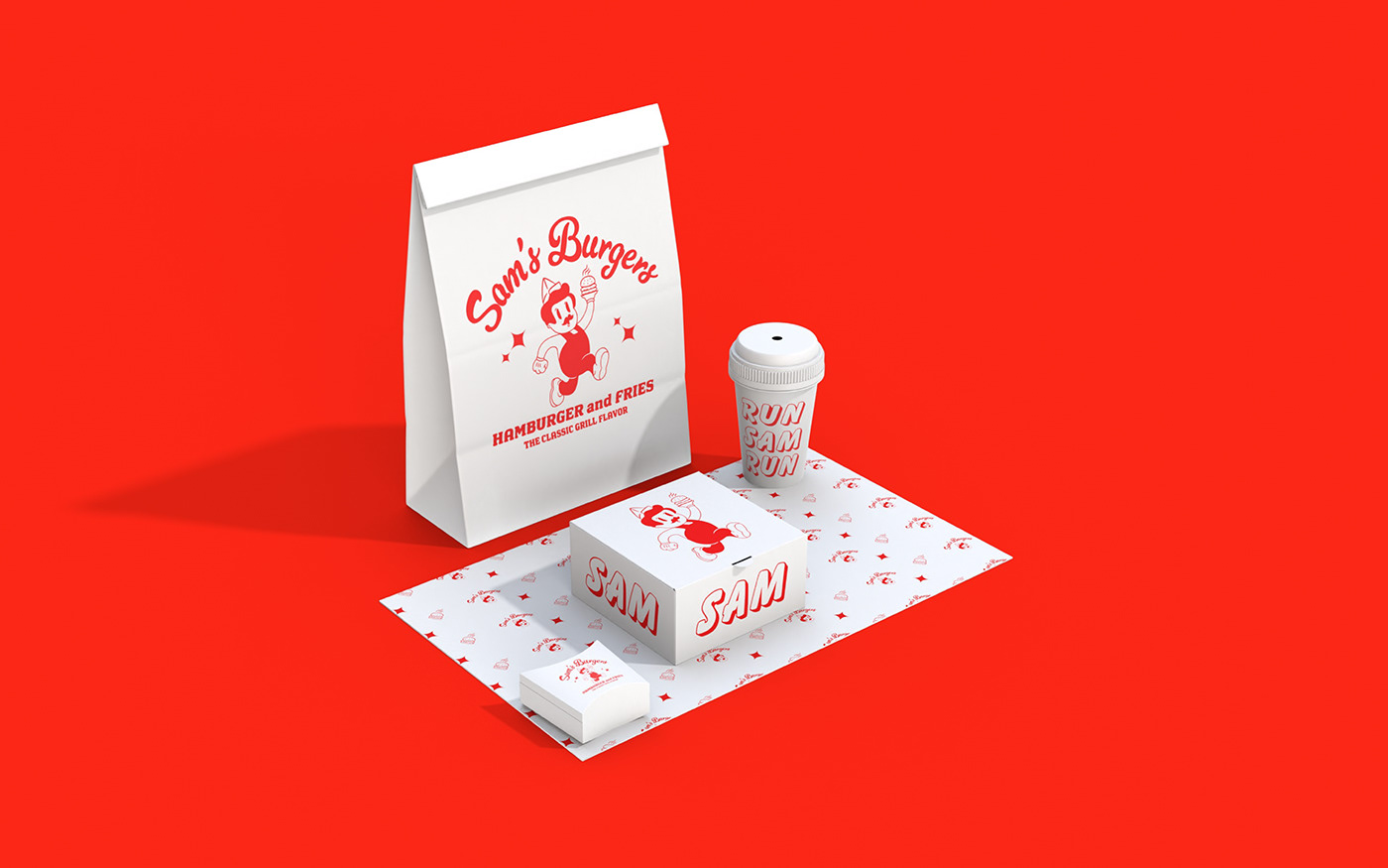
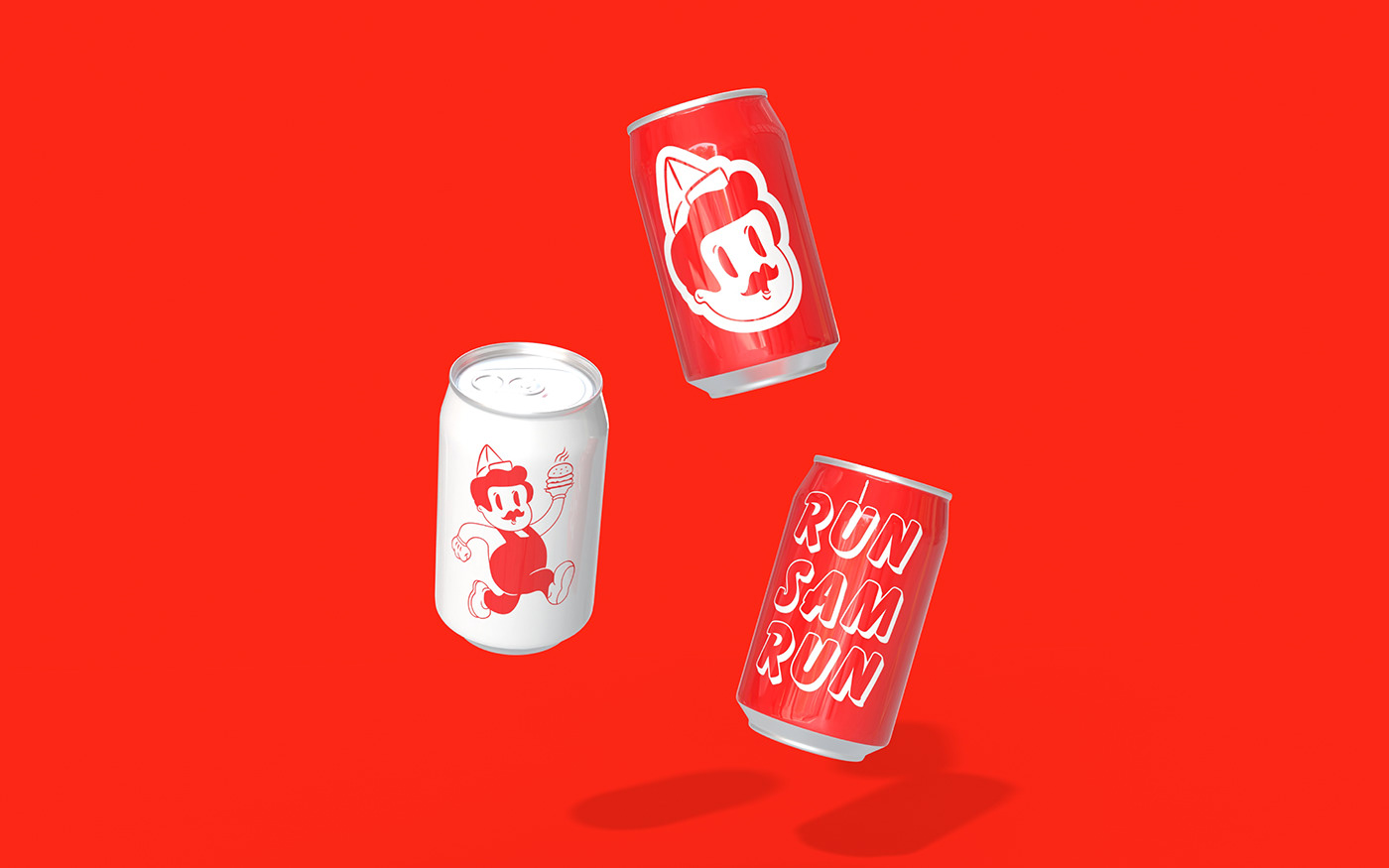
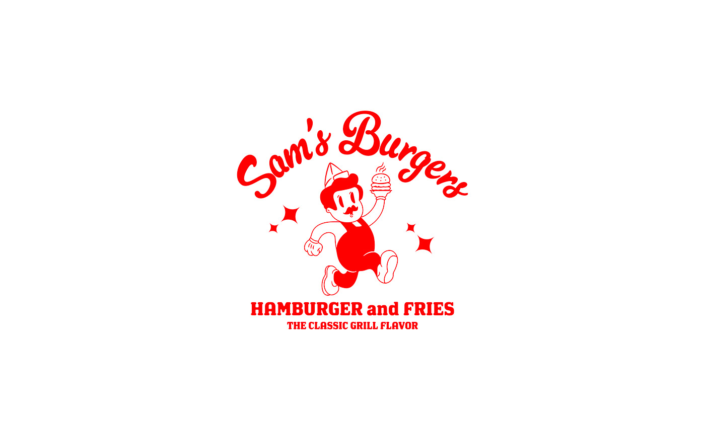
Sam is a fun character inspired by the world of classic characters such as Bugs Bunny, Popeye and Betty Boop, and has a very simple and classic style. The drawing style of the logo takes you out of the 2000s and back to the early 1900s. The designer has created a very simple style here, using only two colors. He has successfully combined the charm of red with the simplicity of white and combined the cuteness of the classic design with the style of today's world.
The logo with a running burger cook and the motto Run Sam Run also conveys the message that the orders are fast and delicious.
Who knows, maybe we'll soon see Sam running through the streets of Los Angeles!